Prep para Pro Campaign (EN/ES)
Jan 1, 2025
Role
Motion Designer · Storyboarding · Animation
Tools
After Effects · Figma
The Prep to Be Pro campaign was a project where I had the opportunity to apply a strategic approach to motion design while collaborating closely with our art director. Through design jams, we worked together to rethink and redefine how motion would work, making key creative and technical decisions to elevate the campaign beyond its successful first version.
One of the biggest challenges was reworking the structure and motion language from the agency’s first flight while maintaining it recognizable as the same campaign. We focused on performance-driven improvements, redefining how tutors would appear on screen, rethinking the pink screens to be more engaging through extra elements exclusive to each spot, and ensuring that key information was presented in a way that maximized clarity, killing noise like UI text that didn't add value to the narrative. We also had to consider practical execution, like structuring our After Effects files to make switching between Spanish and English as seamless as possible.
Below you can see one of the five spots we've launched in 2025:
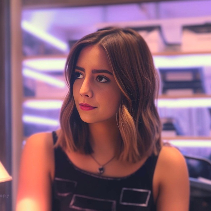
A key strategic decision was making the tutor screen square, creating visual consistency across all spots while making it easier to adapt for different formats, from social media to UGC to digital OOHs, giving it a distinctive look. To further highlight the tutor’s role, we used rotoscopy, allowing the tutor to step out of their video call screen and into the learners' world, reinforcing their importance in the learning journey, while the student now remains inside the screen to maintain focus on the tutor’s presence. Now, every Preply spot follows this rule, creating a consistent look and feel for in the way we portray them.
I also deeply appreciated the motion design process of storyboarding for this project. Sketching out ideas, mapping transitions out, and planning how motion could enhance the storytelling made a huge difference in refining the final animations. As mentioned before, one major shift was in the pink screens, which displayed lyrics or a full phone app demo during the first flight. We introduced live footage with motion to keep engagement high throughout the spot and simplified the app demo parts of it, while integrating them into live footage as well instead of using just pictures, ensuring a more immersive experience that kept the audience hooked to the ad.
This campaign was a great example of how motion design isn’t just about movement, but about strategy, collaboration, and thoughtful storytelling that cares about what the message is. Keeping the second flight recognizable while modernizing its look, incorporating performance insights, and integrating VFX into the narrative made this an exciting challenge, and I loved every step of the process.